
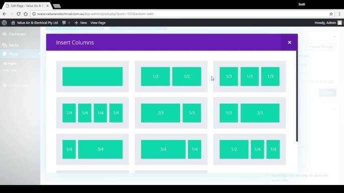
Column Divi Responsif Smartphone – Sebelumnya kita sudah memiliki ulasan mengenai Cara Membuat 2 Kolom Responsive Divi Mobile Phone, pada ulasan ini cara yang bisa kita pakai juga untuk mengubah jumlah kolom pada Divi untuk tampilan website ponsel dan tablet. Sama seperti sebelumnya perlu menambahkan CSS Cuatom untuk menentukanjumlah kolom yang muncul di kolom Divi baik unyuk tampilan ponsel maupun tablet.
Membuat 2 sampai 6 kolom di ponsel dan tablet dengan jarak yang baik antara dan di bawah kolom. Ini adalah cara yang lebih kua tbagus untuk Mengubah Jumlah Kolom Divi Builder Responsive Tampilan Website Handphone dan Tablet.
 1. Menambahkan CSS untuk kolom ponsel dan tablet di Divi
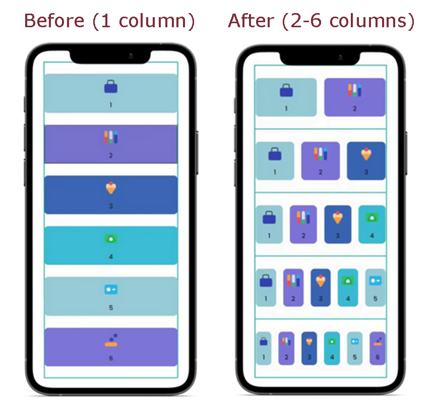
Cara menambahkan CSS Custom untuk mengaktifkan beberapa kolom di ponsel dan tablet di Divi sebagai berikut:
- Masuk ke dasbor WordPress Anda
- Buka Divi » Theme Customizer (Penyesuai Tema) » Additional CSS (CSS Tambahan)
- Salin dan tempel kode CSS di bawah ini:
/*** Change Mobile Columns ***/
/* 2 Columns Mobile */
@media all and (max-width: 767px) {
html .et-db .two-col-mob .et_pb_column {
width:47.25% !important;
}
html .et-db .two-col-mob .et_pb_column:nth-last-child(-n+2) {
margin-bottom:0;
}
html .et-db .two-col-mob .et_pb_column:not(:nth-child(2n)) {
margin-right:5.5% !important;
}
}
/* 3 Columns Mobile */
@media all and (max-width: 767px) {
html .et-db .three-col-mob .et_pb_column {
width:29.6667% !important;
}
html .et-db .three-col-mob .et_pb_column:nth-last-child(-n+3) {
margin-bottom:0;
}
html .et-db .three-col-mob .et_pb_column:not(:nth-child(3n)) {
margin-right:5.5% !important;
}
}
/* 4 Columns Mobile */
@media all and (max-width: 767px) {
html .et-db .four-col-mob .et_pb_column {
width:20.875% !important;
}
html .et-db .four-col-mob .et_pb_column:nth-last-child(-n+4) {
margin-bottom:0;
}
html .et-db .four-col-mob .et_pb_column:not(:nth-child(4n)) {
margin-right:5.5% !important;
}
}
/* 5 Columns Mobile */
@media all and (max-width: 767px) {
html .et-db .five-col-mob .et_pb_column {
width:15.6% !important;
}
html .et-db .five-col-mob .et_pb_column:nth-last-child(-n+5) {
margin-bottom:0;
}
html .et-db .five-col-mob .et_pb_column:not(:nth-child(5n)) {
margin-right:5.5% !important;
}
}
/* 6 Columns Mobile */
@media all and (max-width: 767px) {
html .et-db .six-col-mob .et_pb_column {
width:12.083% !important;
}
html .et-db .six-col-mob .et_pb_column:nth-last-child(-n+6) {
margin-bottom:0;
}
html .et-db .six-col-mob .et_pb_column:not(:nth-child(6n)) {
margin-right:5.5% !important;
}
}
/*** Change Tablet Columns By VictorDuse.com.com ***/
/* 1 Column Tablet */
@media all and (min-width: 768px) and (max-width: 980px) {
html .et-db .one-col-tab .et_pb_column {
margin-right:0 !important;
width:100% !important;
}
html .et-db .one-col-tab .et_pb_column:not(:last-child) {
margin-bottom:30px !important;
}
}
/* 2 Columns Tablet */
@media all and (min-width: 768px) and (max-width: 980px) {
html .et-db .two-col-tab .et_pb_column {
width:47.25% !important;
}
.two-col-tab .et_pb_column:nth-last-child(-n+2) {
margin-bottom:0;
}
html .et-db .two-col-tab .et_pb_column:not(:nth-child(2n)) {
margin-right:5.5% !important;
}
}
/* 3 Columns Tablet */
@media all and (min-width: 768px) and (max-width: 980px) {
html .et-db .three-col-tab .et_pb_column {
width:29.6667% !important;
}
html .et-db .three-col-tab .et_pb_column:nth-last-child(-n+3) {
margin-bottom:0;
}
html .et-db .three-col-tab .et_pb_column:not(:nth-child(3n)) {
margin-right:5.5% !important;
}
}
/* 4 Columns Tablet */
@media all and (min-width: 768px) and (max-width: 980px) {
html .et-db .four-col-tab .et_pb_column {
width:20.875% !important;
}
html .et-db .four-col-tab .et_pb_column:nth-last-child(-n+4) {
margin-bottom:0;
}
html .et-db .four-col-tab .et_pb_column:not(:nth-child(4n)) {
margin-right:5.5% !important;
}
}
/* 5 Columns Tablet */
@media all and (min-width: 768px) and (max-width: 980px) {
html .et-db .five-col-tab .et_pb_column {
width:15.6% !important;
}
.five-col-mob .et_pb_column:nth-last-child(-n+5) {
margin-bottom:0;
}
html .et-db .five-col-tab .et_pb_column:not(:nth-child(5n)) {
margin-right:5.5% !important;
}
}
/* 6 Columns Tablet */
@media all and (min-width: 768px) and (max-width: 980px) {
html .et-db .six-col-tab .et_pb_column {
width:12.083% !important;
}
html .et-db .six-col-tab .et_pb_column:nth-last-child(-n+6) {
margin-bottom:0;
}
html .et-db .six-col-tab .et_pb_column:not(:nth-child(6n)) {
margin-right:5.5% !important;
}
}
Column Divi Responsive Tablet, Divi Column Mobile Phone – Sumber Kode: victorduse.com
2. Menambahkan Kode CSS CLASSES ke Divi ROW
Untuk mengubah jumlah kolom untuk tampilan website seluler dan tablet, Kamu perlu menambahkan kode ke Divi Row pada bagian CSS CLASSES. Berikut langkahnya
- Pilih dn edit halaman yang ingin merubah kolom
- Edit Row (yaitu kotak dengan batas hijau) dengan mengklik roda gigi
- Buka Pada Tab Advanced » CSS ID & Classes » CSS Class
- Tambahkan satu atau dua CSS Class, sesuaikan dengan jumlah kolom yang ingin di gunakan, dari tabel di bawah.
| Number of columns | Mobile CSS class | Tablet CSS class |
| One | [no class needed] | one-col-tab |
| Two | two-col-mob | two-col-tab |
| Three | three-col-mob | three-col-tab |
| Four | four-col-mob | four-col-tab |
| Five | five-col-mob | five-col-tab |
| Six | six-col-mob | six-col-tab |
Tabel di atas untuk penggunaan CLASS seperti “three-col-mob three-col-tab” untuk menampilkan tiga kolom di tablet dan tiga kolom di smartphone (sama seperti di desktop).
Cara menerapkanCSS Classes pada Divi Row
Berikut cara untuk menerapkan kode pada CSS Classes mengubah jumlah kolom untuk ponsel dan tablet di Divi Row. Biarkan saja kolom Kelas CSS kosong jika Anda ingin menggunakan jumlah kolom default.
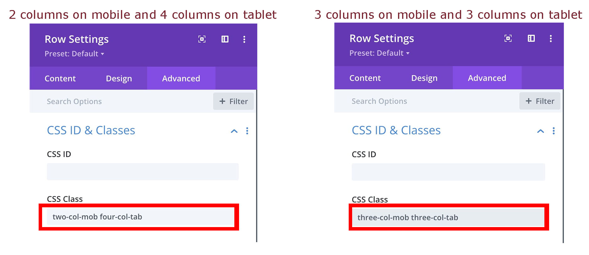 two-col-mob four-col-tab three-col-mob three-col-tab
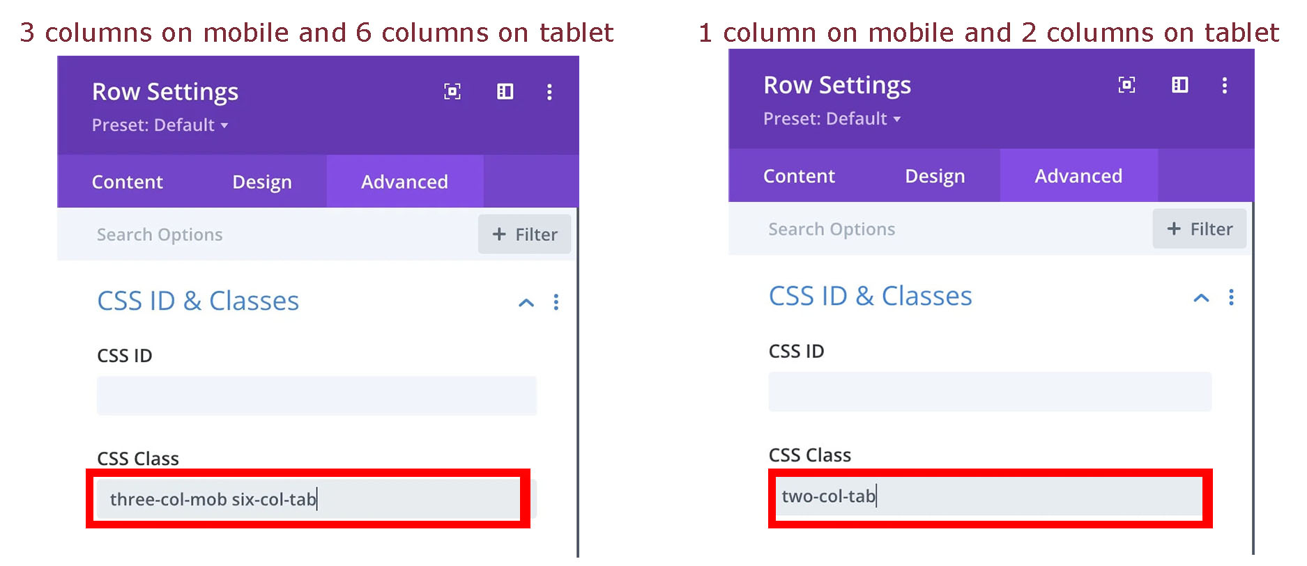 three-col-mob six-col-tab two-col-mob
Dengan penambahan pada kolom CSS CLASS dengan memasukan jumlah kolom yaang diinginkan maka sudah bisa terbentuk kolom untuk column responsive mobile phone dan juga Column Divi Responsive Tablet.
Baca Artikel sebelumnya Cara Membuat 2 Kolom Responsive Divi Mobile Phone